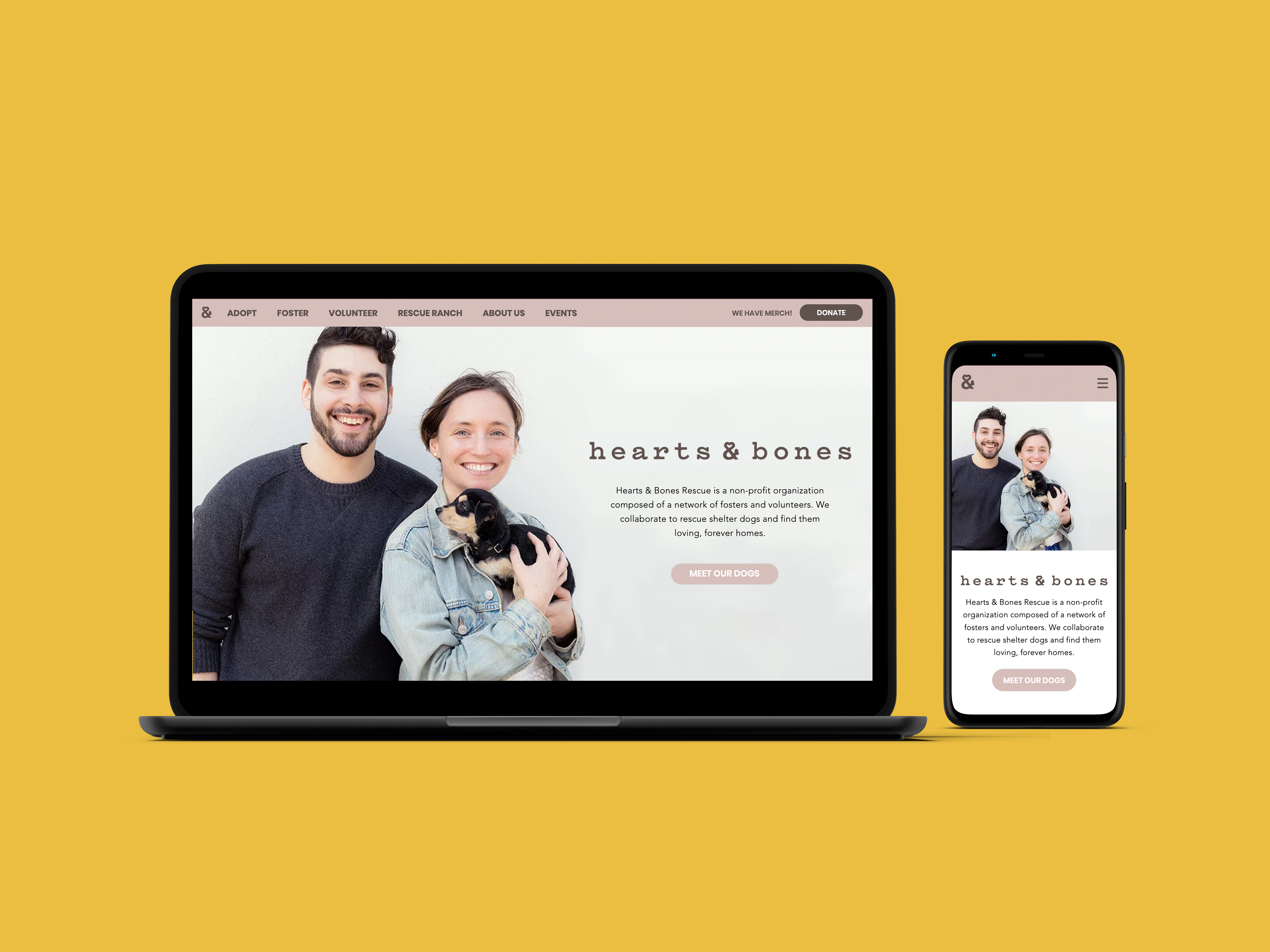
Hearts & Bones is a non-profit dog rescue organization based in Dallas, TX and New York City. As part of the Wix Playground team, I worked on a project to rebuild the website for Hearts & Bones.

My Role
UI/UX Design
User Reasearch
Website Build (Wix Editor)
Team Members
Ari Kushmirak
Deliverables
Desktop Website
Mobile Website
Hearts & Bones was receiving numerous feedback on the poor experience of using their website to navigate information. As a non-profit organization, Hearts & Bones have an extensive amount of information that needs to be stated on their website for different users of this platform.
To better understand the problems current users are facing with the website, we decided to conduct primary research surveying actual users of the website.
ORIGINAL WEBSITE
We did some internal research with the staff from Hearts & Bones and devised a list of problems they've realised users were facing with the website. We also analysed the structure and content of the original website to try and figure out how to organize the information in a more effective way.
.d9f77c7c92d83dda17a3.jpg)
.17ed5bf802ba75257d90.png)
“We commonly get a lot of emails asking about information that's already clearly listed on the website.” — Hearts & Bones Staff
PRELIMINARY SURVEY
We did some user research at one of Hearts & Bones’ adoption events with users from the 4 main groups: Adopters, Volunteers, Fosters and Donors, to find out more about their basic user behaviours and general goals when visiting Hearts & Bones’ website.

“The information is very scattered. I have to really try and find the things I'm looking for sometimes.” — Potential Adoptor
“It took me a while to figure out the process of adoption and even after that I'm not so sure if what I got was correct.” — Potential Adoptor
INSIGHTS
From our survey and short interviews with the staff and users of the website, we summarized the most common needs and goals of them.
-
Users want the information to be more organized and structured.
-
Users want better user flow that clearly indicates the process.
-
Users want to focus on the information they need to know and worry about additional information later.
-
Users want to be able to access the website on a mobile as fluidly as they would on a desktop.
INFORMATION ARCHITECTURE
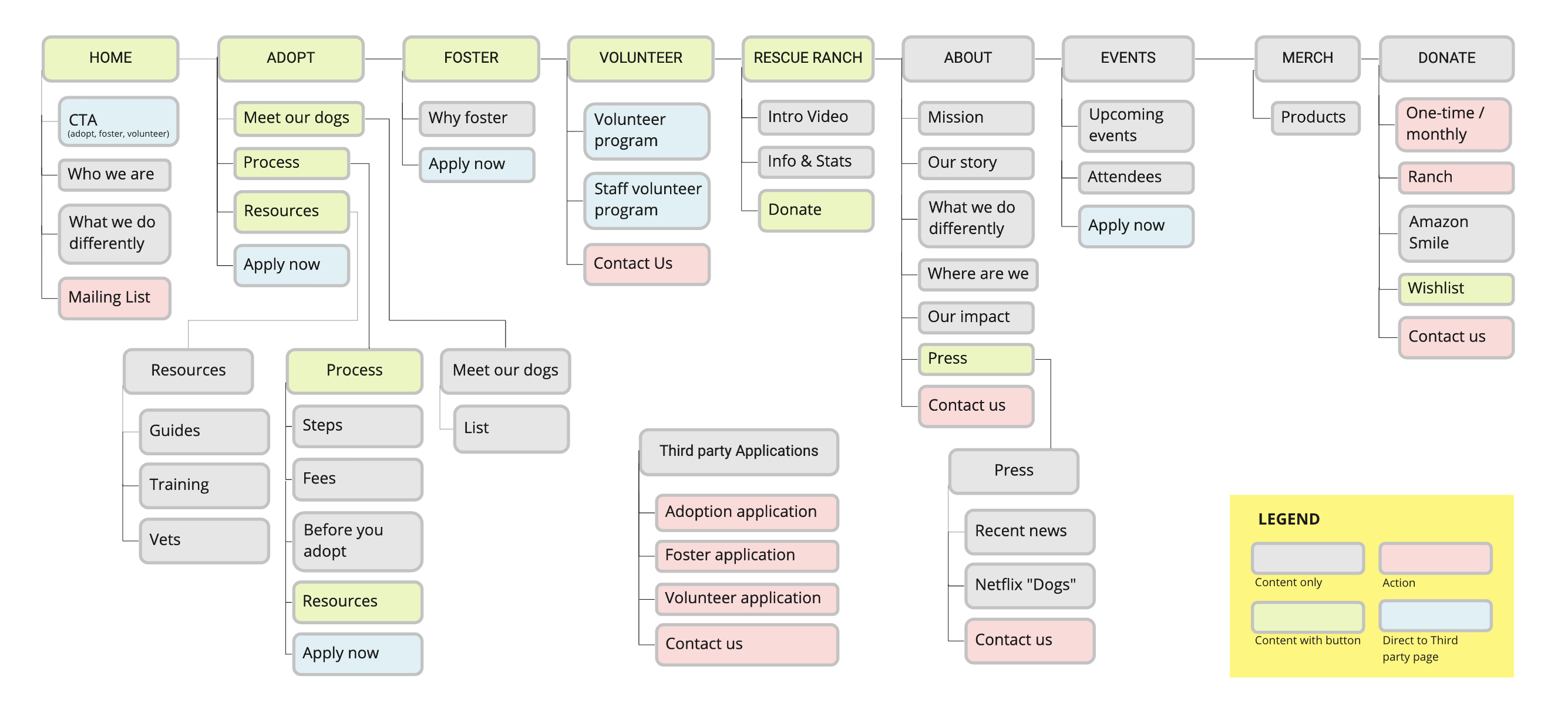
We’ve rearranged the website structure so the menu show where different user groups would navigate to. To create a more fluid user flow, pages in the same category are compiled onto a single page so users don’t have to keep referring back to the menu and being redirected to a new page.
LO-FI WIREFRAME
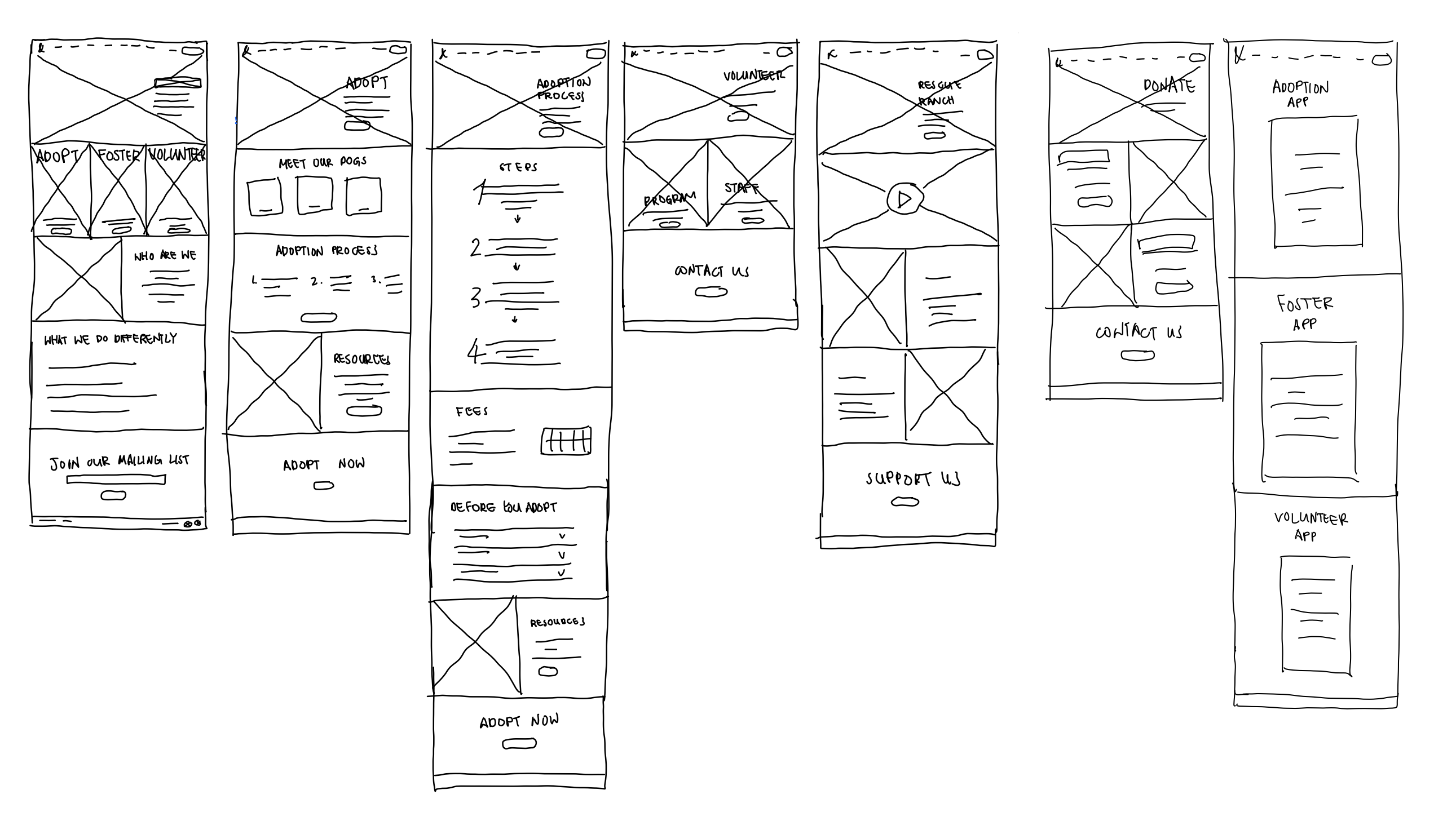
We sketched out multiple lo-fi wireframes of the pages that have most dynamic contents to test out how to restructure the informations and flow so users won't constantly feel confused and overwhelmed. We've decided create a main page for each user group that introduces the general flow, so users get a better sense of the overall scope of each process.
For steps that require more explanation, we complied all of the additional information in each flow onto one continuous page. This way users who wish to read more into the details could find all the information they need on one single page without having to navigate back and forth to find them.
MID-FI WIREFRAME PROTOTYPE
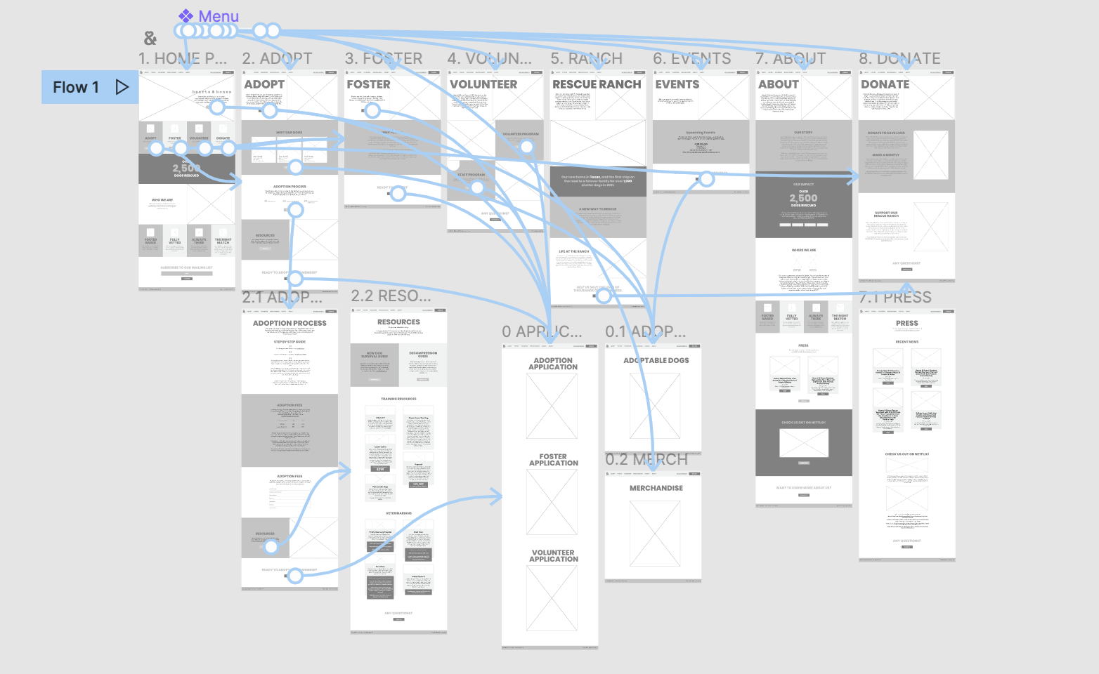
After settling down on the overall layout of the website, we went on to create a mid-fi wireframe of all the pages as well as a protype.
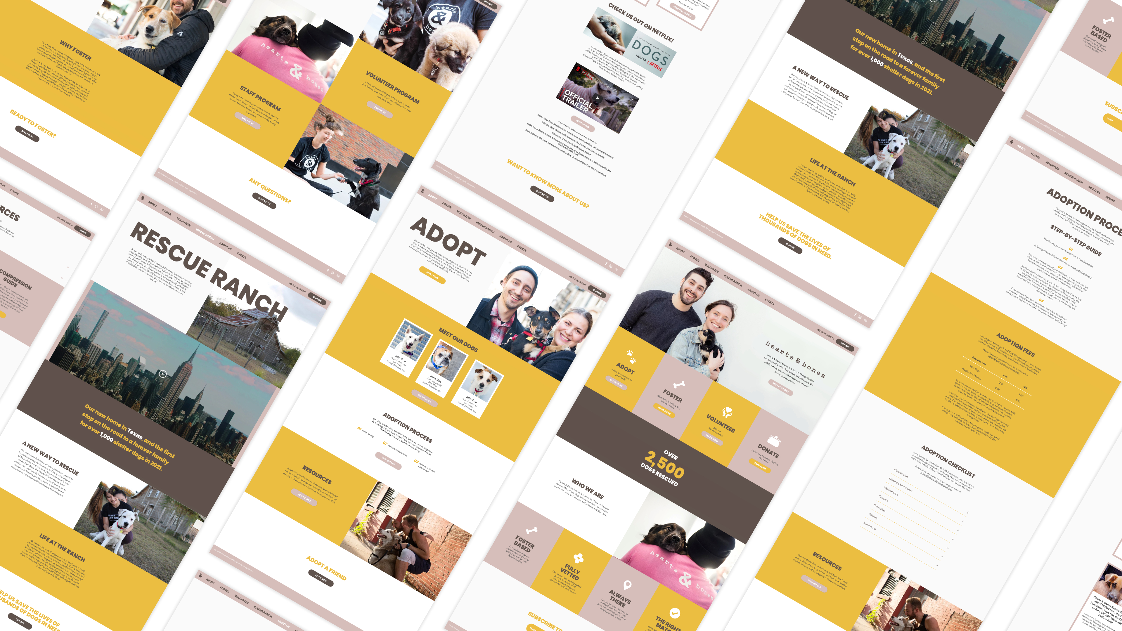
The use of spaces and large images helps to break up long pieces of information and make the overall UI of the website more reader-friendly. Information is easier to view and process back and forth. CTA buttons that lead to the applications page are also included at the top and bottom of each page for a clearer purpose.
The final layout is kept simple as the photos are meant to be changed regularly featuring new adoptable dogs all the time, so choosing a layout that’s interchangeable with any photo composition was crucial.
MOBILE VERSION
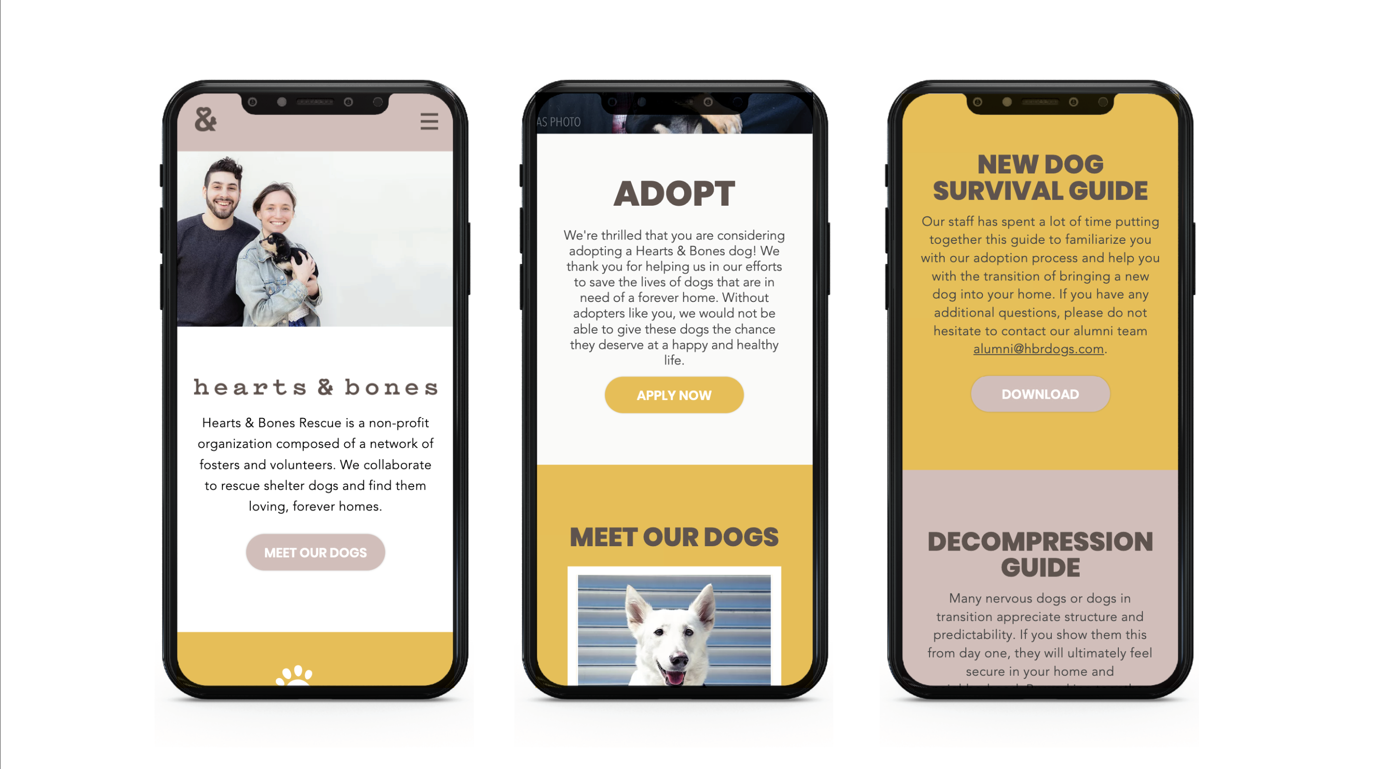
We kept in mind the mobile users take up a huge percentage of Hearts & Bones’ demographic, so we implicated the desktop design into a mobile version as well.
FINAL WEBSITE
As a part of the Wix Design Academy, we built the final website with the Wix Editor.
View the final live website here
Note: The website is updated by Hearts & Bones staff after completion of this project. Therefore, current website might vary from the designs shown in this presentation
