Lash In Bloom is a branding project for a Singaporean salon, Browhaus, on launching their new lash extension service.
www.browhaus.com/lashinbloom/
My Role
Lead Designer
Team Members
Chloe Low
Mei Yin Ying
Deliverables
Key Visual
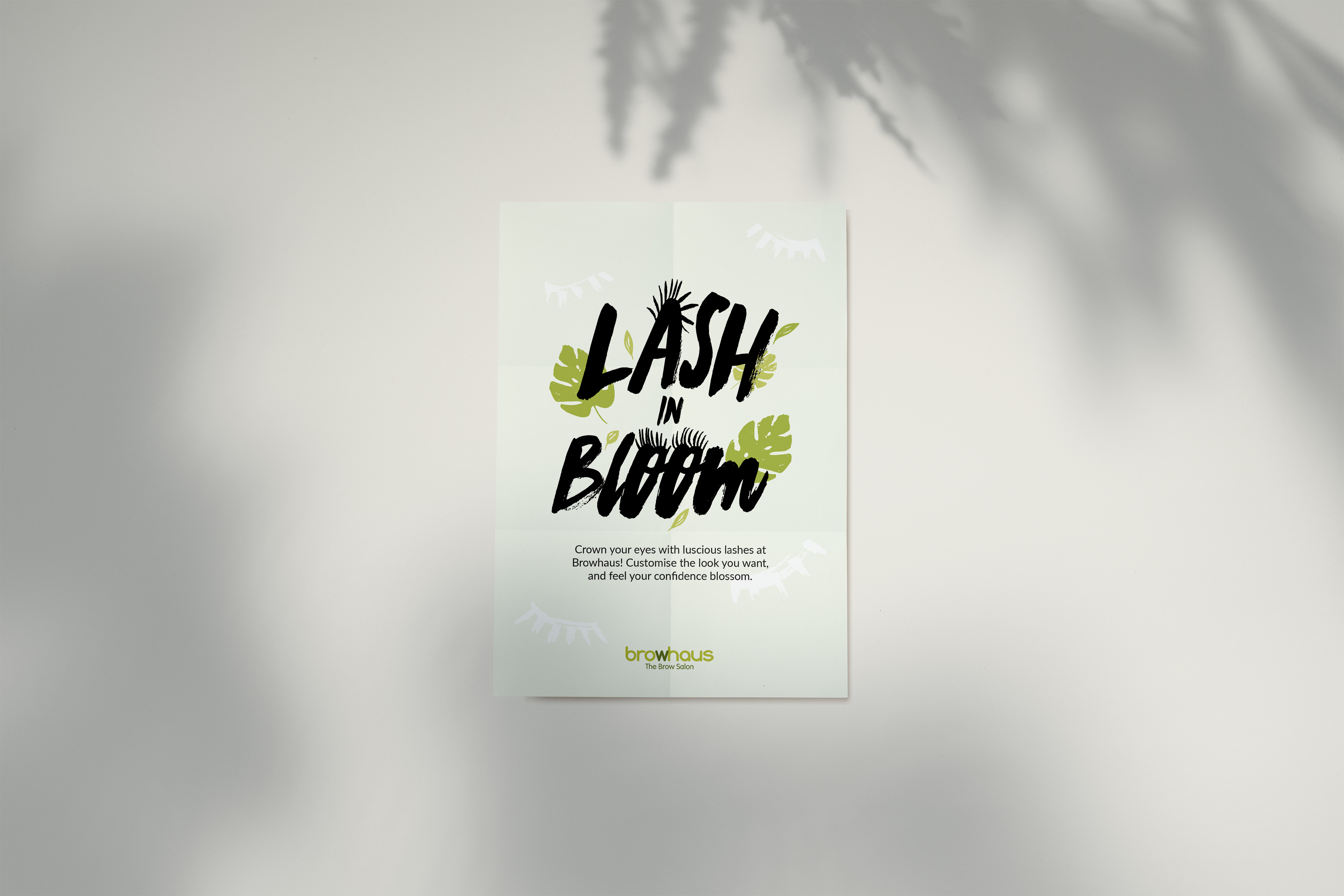
Posters
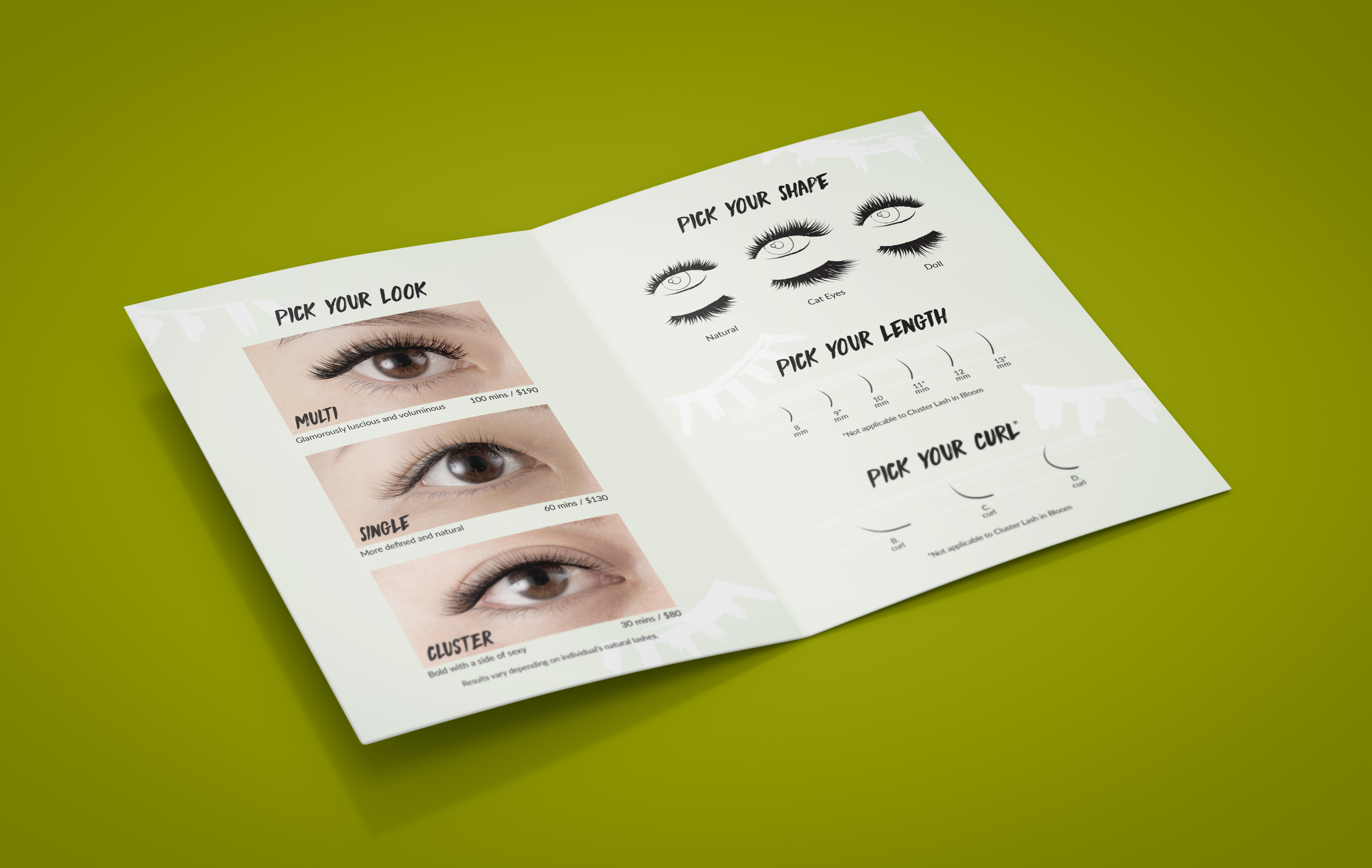
Pamphlets
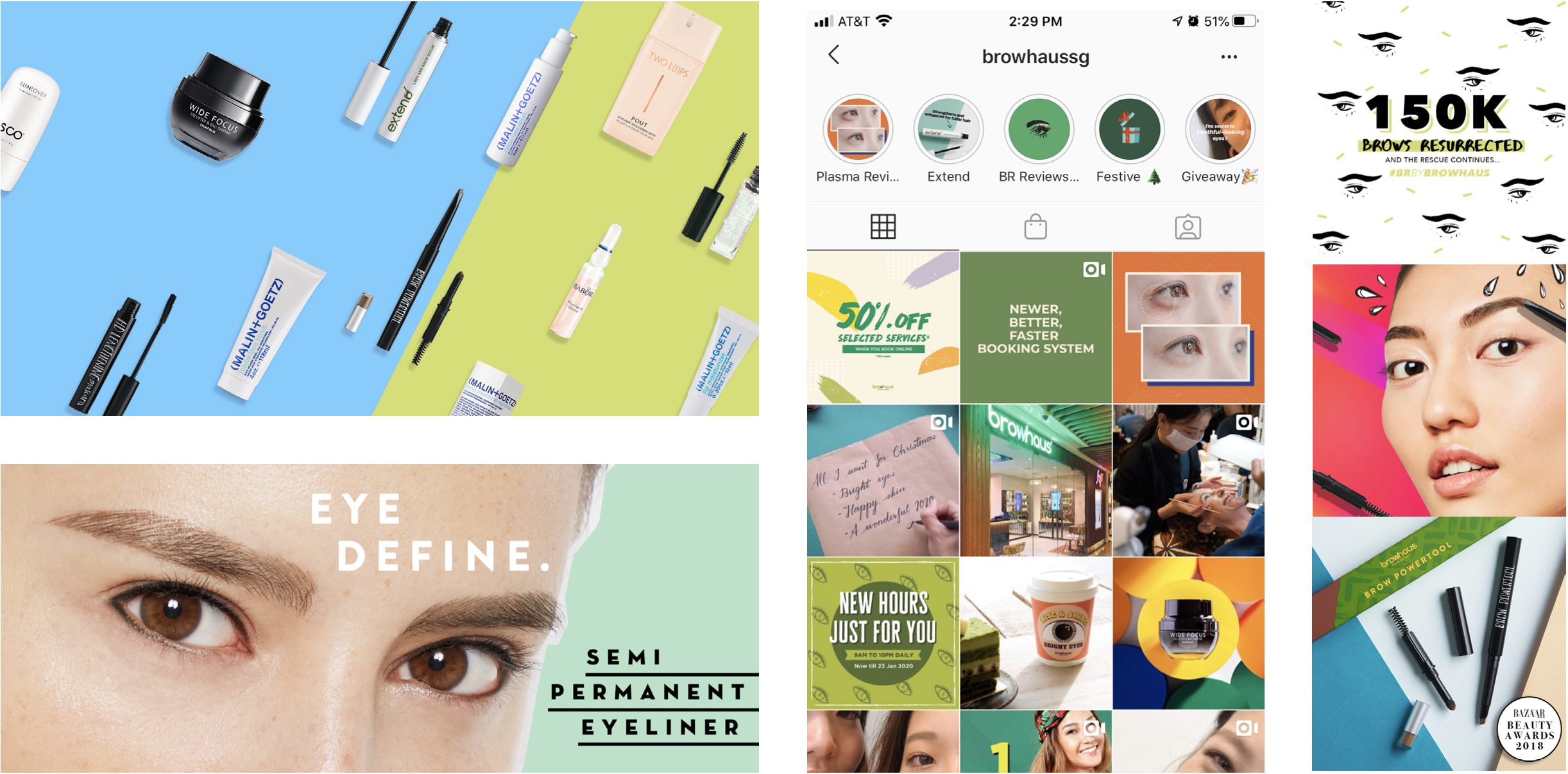
Social Media Assets
Website
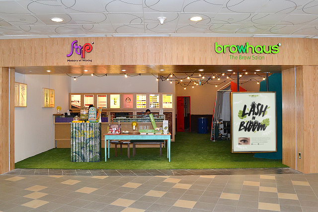
Browhaus is a salon that specialized in brow and lash grooming services with stores in Singapore, London, New York, Shanghai, and more. The visual style of the brand often uses bright colors with clean illustrative playful design in order to appeal to younger audiences.
The target customers of this service and the brand are young customers around the age of 18 to 35. Therefore, the visuals for this service had to be fresh and eyecatchy.
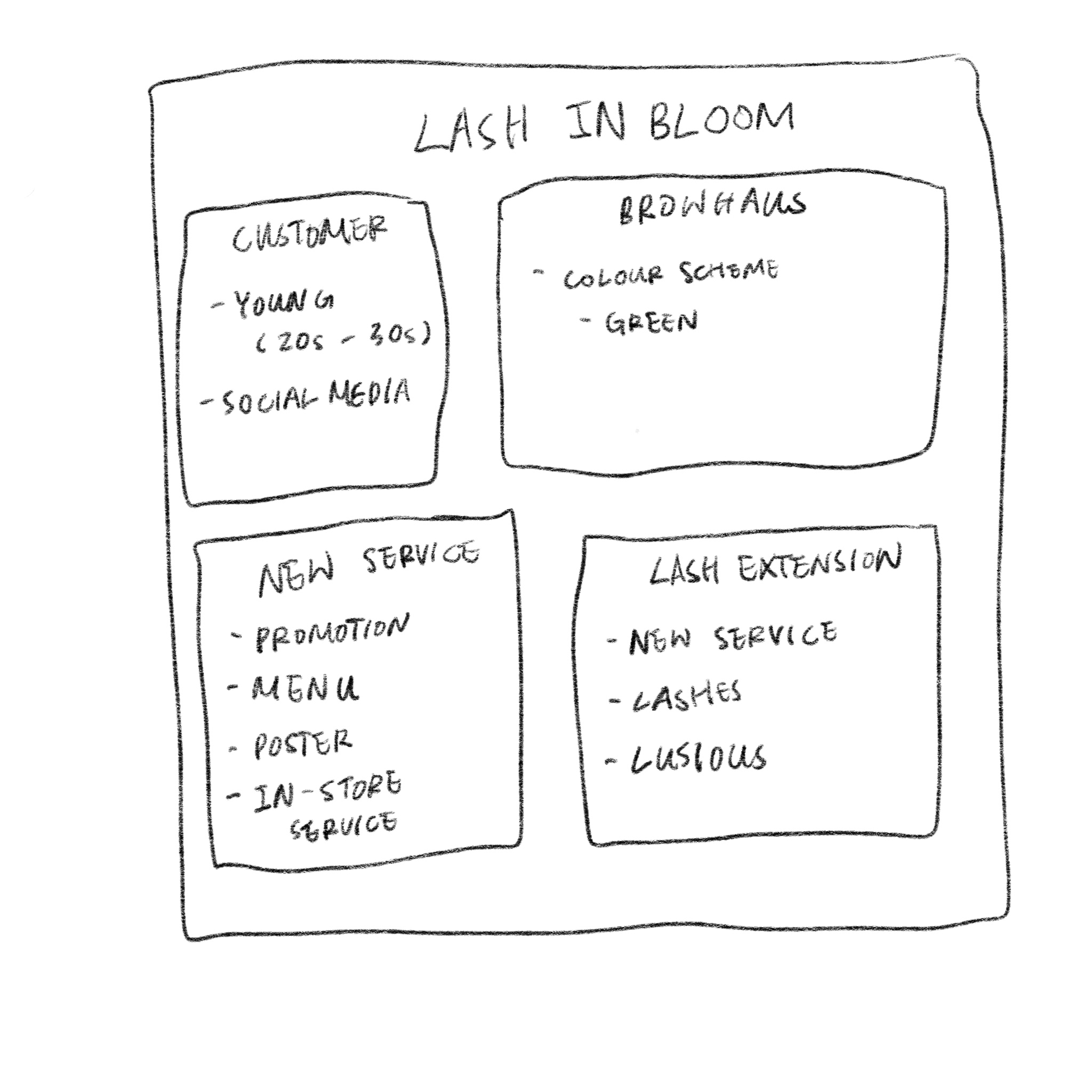
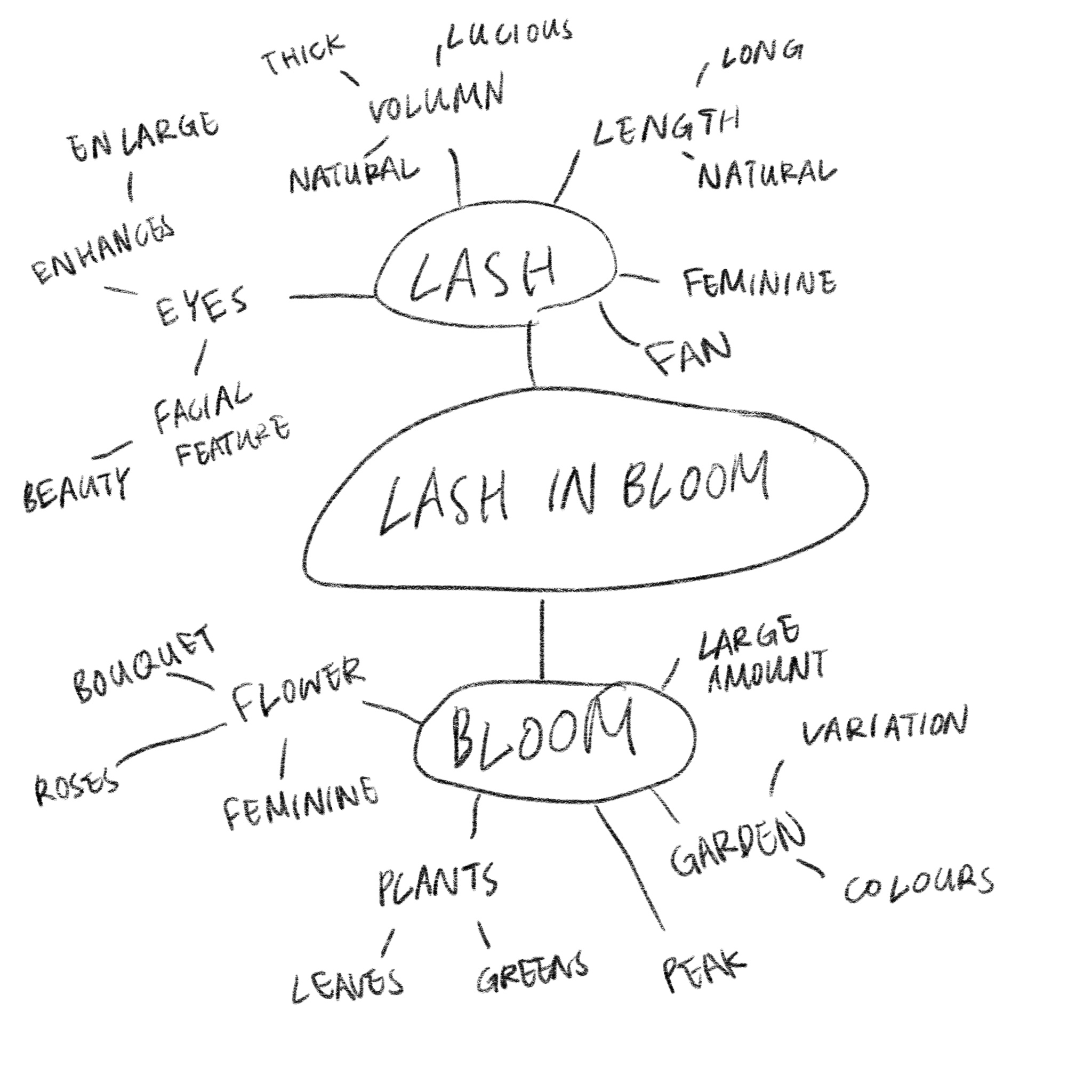
I started out experimenting with different styles that fit the overall brand image of Browhaus. Focusing on floral and illustrative styles that are bright and attractive. The team liked the idea of using dandelions to represent the idea on "Bloom" and the green coloration that fits well with the brand image.
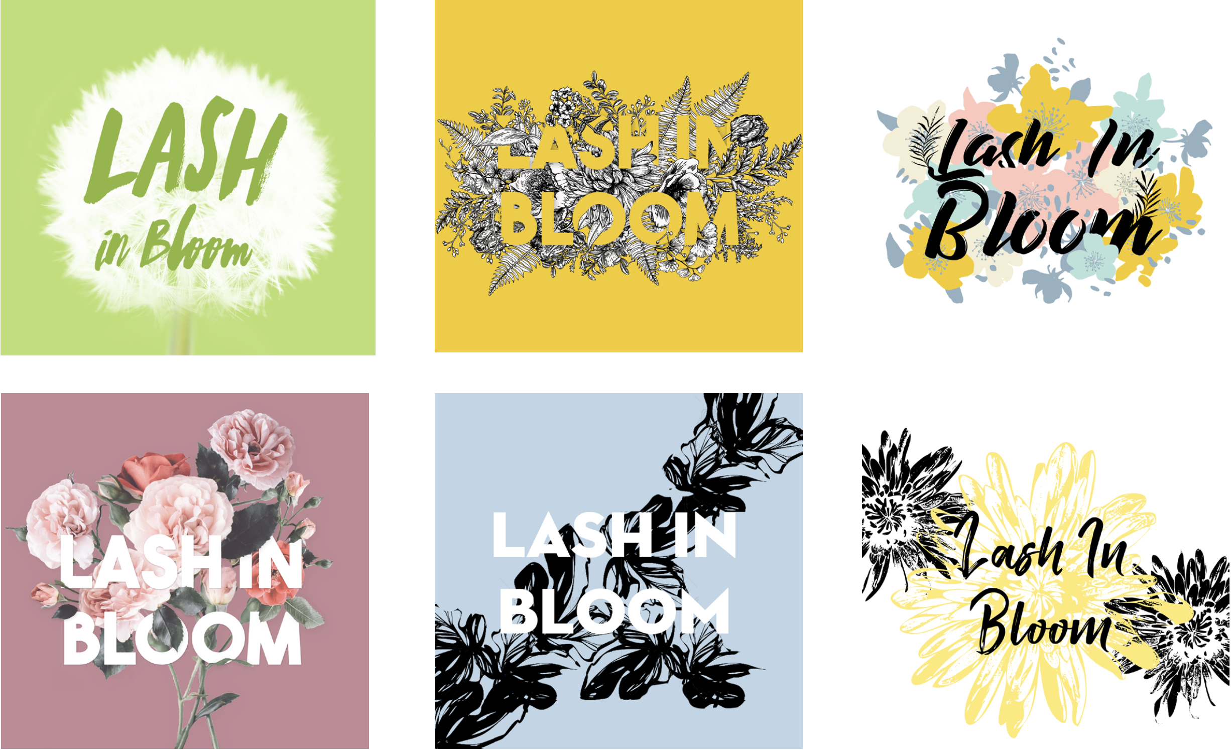
Working from the first round of designs, we decided to combine the idea of dandelion with a more illustrative style that captures the strands of the dandelions representing luscious lashes.
We realized the visual then became overcrowded with all the lines and stokes from the illustrative typeface as well as the dandelion, so we discarded the dandelions and incorporated strokes on top of the typeface to represent the lashes.
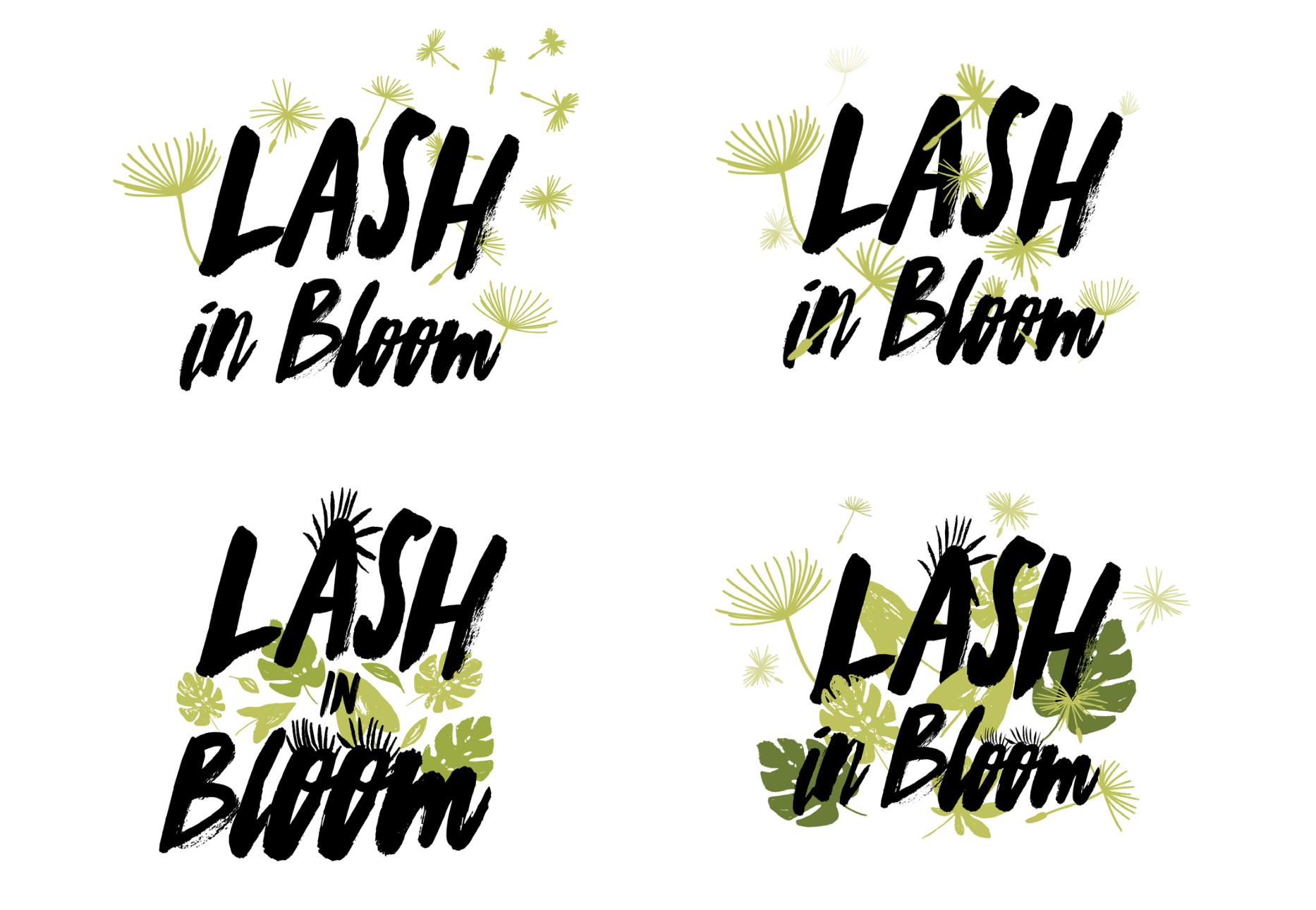
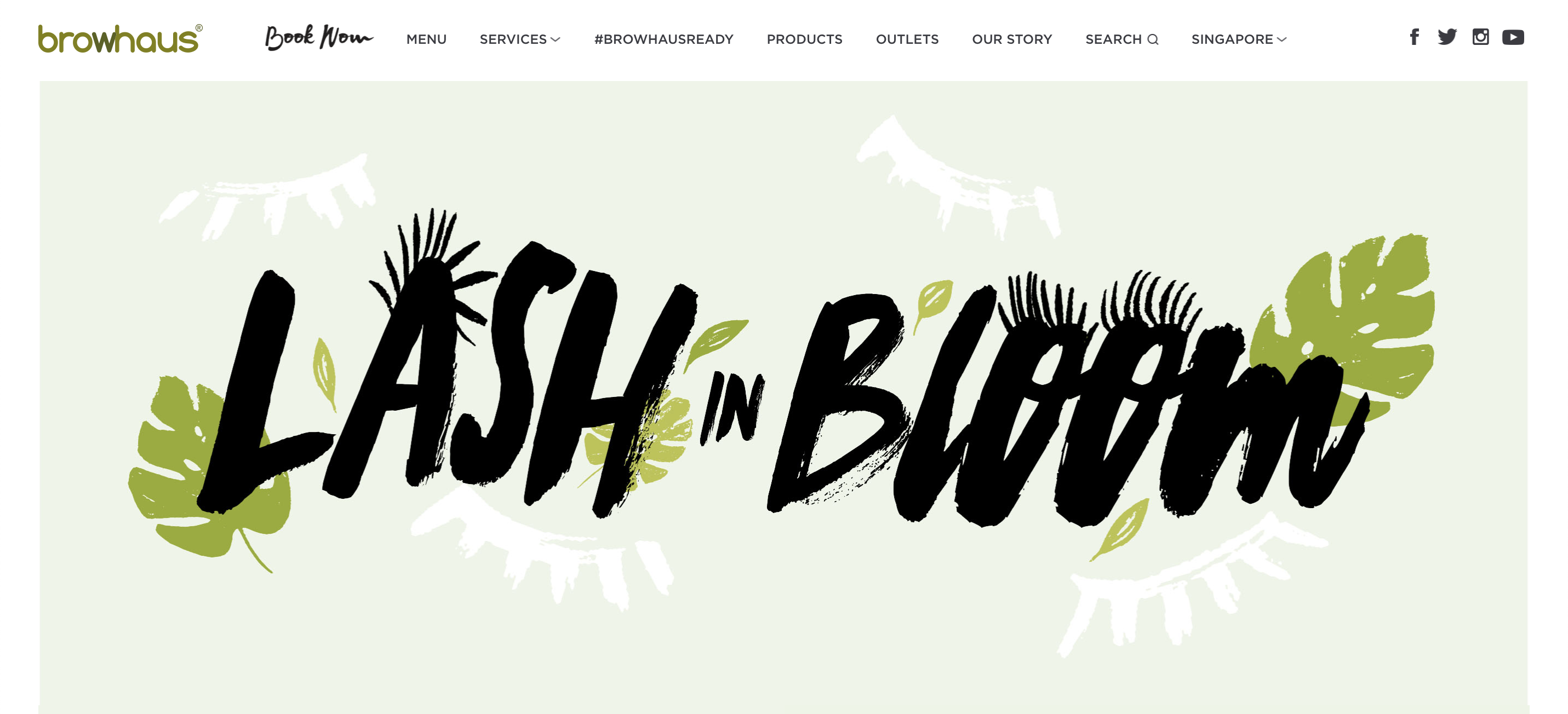
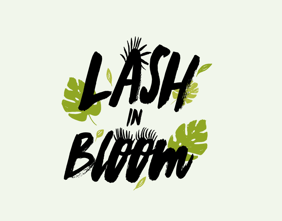
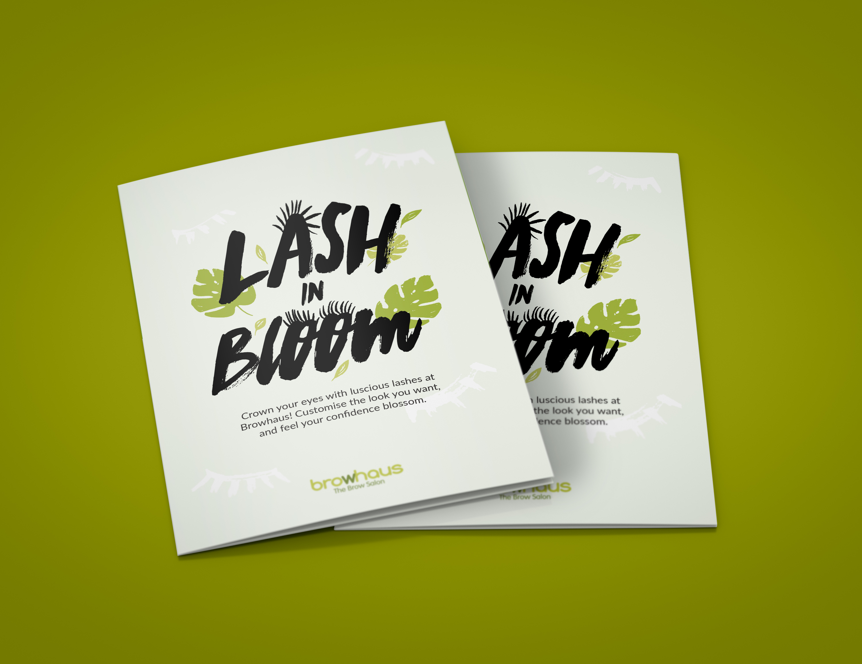
To match the overall identity of Browhaus's brand, the final visual utilized shades of green and tropical leaves to represent the natural blooming effect. A hand-written style typeface was also chosen to mimic the texture of natural lashes. By reducing the number of leaves and additional elements, we managed to change the focus on the text while keeping the essence of nature.
To match the overall identity of Browhaus's brand, the final visual utilized shades of green and tropical leaves to represent the natural blooming effect. A hand-written style typeface was also chosen to mimic the texture of natural lashes. By reducing the number of leaves and additional elements, we managed to change the focus on the text while keeping the essence of nature.
SOCIAL MEDIA ASSETS To match the overall identity of Browhaus's brand, the final visual utilized shades of green and tropical leaves to represent the natural blooming effect. A hand-written style typeface was also chosen to mimic the texture of natural lashes. By reducing the number of leaves and additional elements, we managed to change the focus on the text while keeping the essence of nature.
WEBSITE
Visit the Lash in Bloom website to find out more designs in use.
www.browhaus.com/lashinbloom/